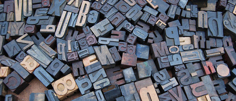
Every designer knows what a type is. It’s well known that typography is the art of creating legible and visually attractive letters and graphic signs. Almost every designer can notice the difference between the different fonts. Even though many of them don’t know the anatomy of type.
We think it’s pretty essential to know every part of the letters. When you’re going to create your own type, you need to give the correct use to all these parts.
Before speaking about them, it’s a good idea to remember the typeface classification, which is a serif, and sans serif.
Serif letters have a traditional look. It began when the letters were carved in stone. It was hard for the artists to give a straight finish to the letters, so they created little ornaments to put at the end of them.
Times, Georgia, Garamond, and Courier are the most common serif types. This is the most used type to create logos, and they are used to writing a lot of information because they are easier to read.

The sans serif ones are the letters without the little ornaments at the end. They are used in titles but not in long texts, so they are difficult to read. The decorations of serif letters act as a guide for the eye.
Nowadays, there are many sans serif types such as Arial, Verdana, Calibri, and Tahoma. When you’re writing in a digital format, it’s better to use a sans serif font, and they look sharper on a screen than the serif ones.
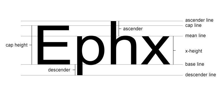
When you create a type, you need to know there are two different measures for the letters that you must follow. The first one is the X-height. It’s basically the height of all lowercase letters without an ascender or descender part. It is called x-height because this letter will determine the size.
The second measure you need to know is the Cap Height, which is the size that every capital letter should have. This one is determined for a letter with a flat bottom, like the capital “E.”
To make these sizes easier, it is recommended to use a layout grid with some reference lines. The first line your grid must-have is a baseline, where almost all the letters will be placed, even the capital ones.
Other essential lines are the mean line to establish the X-height and the capital line serving as a guide for cap height. Finally, there are two more lines that every layout grid for types must have; these are the ascender and descender lines.
The ascender line must be above the mean and the capital line. This will determine the ascender part of the letters. The descender line must be under the baseline, and it’s destined for the descender parts of the letters.
An essential part of any text is the spaces. It can sound insignificant, but they make the text easier to read. Without them, it will be practically impossible to understand anything.
Leading, also known as line spacing, is the distance between two baselines in a text. Its correct use will improve the look of the text and its readability. Increasing the line spacing will allow the text to breathe, and it will look better.
Another space, the kerning, is basically the space between each letter of a word. This makes the words more attractive and readable.
Also, it avoids confusing some letters with each other. For example, when an “r” and an “n” are sides by the side in a text without proper kerning, they may look like an m. Of course, all the letters need to have the same space between them.
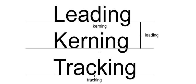
Finally, tracking. This space is pretty related to kerning, but you can’t confuse them. This one is the space between some letters of the text to affect the visual density of the whole block. This isn’t necessarily applied in all the text as kerning does.
Closer Look On The Anatomy Of Type
Knowing all those essential elements that help make a text readable and attractive, we can start talking about the anatomy of type. Since its beginning, the style has been evolving, and this evolution has been in its shape and readability.
The improvement of technology has allowed evolution in the shape of the type. Nowadays, you can give it a drawn form that wasn’t possible a few years ago.
The words used to describe the different parts of the letters are related to some parts of the human body. That’s why the letters have arms, legs, and even shoulders. Like tails or ascender, other words aren’t related to our body, but they are easy to remember. The anatomy features of the letters are:
- Leg: is a part of the letter that goes down to the baseline. A characteristic of this part is that is added to the letter on one side, and it’s free on the other side. An example of this part is the descender part of the “k”.
- Arm: this part of the letter is similar to the leg, but this one goes up. It could be until de middle line or the capital line. This line could be straight or diagonal. An example is the upper part of the capital “E”.
- Shoulder: this is a curved line that goes down and right. It’s comparable with the curve of the left human shoulder. This is present in lowercase “h”, “m”, and “n”.
- Tail: is a decorative curve that is drawn in the capital “Q”, “R” or “K” on their descender part.
- Stem: is the main vertical line of some letters. Also, is the main diagonal line of capital “A” and “V”.
- Ascender: it’s a vertical line that extends upwards until de ascender line. You can see a perfect example of this part in a lowercase “d”, “b” or “t”.
- Descender: it’s a vertical line that extends downwards until the descender line. You can observe it in a lowercase “q” or “p”.
- Bar: it’s a horizontal line in letters like capital “A” or “T”, or in a lowercase “f”.
- Swash: it’s an ornament line to replace a serif in any capital letter. Some designers say that it’s fancier.
- Serif and terminal: serif is a little line drawn at the end of a letter as an ornament. When a letter doesn’t have a serif, this final part is called the terminal.
- Bowl: is a curve line that creates a closed space in the letter, like in the capital and lowercase “D” and “B”.
- Spine: it’s the principal curved line inside an “S”. It’s comparable with the spine of a woman.
- Link: is the connection between a bowl and a loop in a lowercase “g” in some fonts.
- Loop: it’s the lower part of the lowercase “g” in some fonts.
- Ear: is a little stroke in some fonts that is used as an ornament. It is used almost always in a lowercase “g”.

It’s pretty essential to know the anatomy of type. When creating a new font, all these parts can be modified or adjusted to your necessities. The most important thing is that you can’t change them too much to prevent the loss of readability.
Also, you need to use the perfect spaces and sizes in the text, which will considerably improve the entire text. Remember, you can make a type as intricate as you want, but you have to make the text easy to understand.
If you liked this article, be sure to check out my other articles about Typography.

