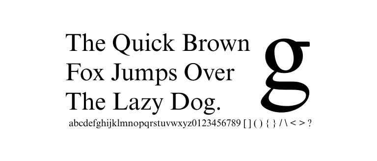
There are two categories of fonts, and all the fonts fall in these two categories. We all use fonts, but you might not know which group of fonts you are using. There are two main font types: sans-serif and serif, and in this article, I will tell you the difference between the two. But before that, let me tell you how and where they should be used.
Serif Fonts in More Detail
Serif fonts – serif fonts have an extension on the end of their letters. The word serif means, in general, tiny decorative extension strokes that are attached to each character. Each serif letter has an extension that helps them stand out when reading different words.
Serif font is the more evolved version of letters carved into the stone people wrote on. In the beginning, people only used to engrave letters on rocks, slowly forming words and whole sentences later.

Because letters were carved into the rocks, there used to be a natural extension stroke at the end of each letter.
These strokes were natural. People only carved messages on stones when something significant had to be written in those days because letters engraved into the stone would last long.
Thought history serif fonts were used because they look conservative and stand out. So, the message written with serif font was easily read by the people it was meant for.
Sans-Serif Font from A to Z
The word sans means without. So, sans-serif fonts are without s
Sans-serif fonts were first used in 1816 by William Caslon IV in his typeface book. It started becoming popular, and people loved this new typeface. It began to appear all over Europe, and from there, the word spread, and sans serif type began popping up worldwide.

his typeface appeared in Europe under the name “Grotesque.” In the US, it was called “Sans-Serif.”
The simplicity and boldness of sans-serif made people fall in love with this new typeface, which is why it’s the most common type used in different media, from print publications to websites.
The quality of sans-serif font shines especially in the digital world, where letters appear more clearly on the screen, which helps with the text’s overall readability.
About the Most Popular Font: Times New Roman
There are a lot of popular serif fonts, but among the most popular is Times New Roman. Times New Roman is the most widely used serif font, and it is the most renowned serif font globally. A lot of print media is written with this font.
Times new roman was created when the British newspaper company Times of London hired an unknown typeface creator to create a new font for their newspaper. The typographer employed by the Times of London was Stanley Morison.

The established project leader created a new typeface for the newspaper company “Times of London.”
Stanley Morison supervised the project and had Victor Lardent under his wing, an advertisement guy in The Times of London newspaper company.
Stanley Morison and Victor Lardent created the new typeface, a new official font for the Time of London newspaper. The font became instantly liked, and people loved reading articles written with the new typeface.
Now, you have to understand this font was created around the 1920s, so we should keep in mind that at that time, there were not as many sans-serif typefaces around as they are today.

Times new roman is still pretty commonly used in court. Though it is almost impossible to write in Times new roman, lawyers must type and print all necessary documents in precisely 12 points in Times New Roman. But you don’t need to submit your legal papers in Times New Roman if you get yourself in the situation where you will be submitting one.
Times new roman was initially created for a newspaper and makes sentences occupy less space, enabling publishers to print more information on each paper page.
About Most Popular Sans-Serif Font: Arial
There are also a lot of favorite sans-serif fonts. Still, the most widely used sans-serif font is Arial, one of the digital typefaces. We can safely say that the new era ushered in a new era for modern typefaces.
Arial was first programmed and used in a 1990s IBM machine. This font is simple and easy to understand, and the font came pre-installed on the 1990s IBM machines.

It was a big hit in the typeface world and made IBM proud of their new typeface creation, loved by users worldwide.
The market for Serifs fonts decreased as the new fonts and typefaces of san-serif started to appear. Arial font is liked because it is easy to read and is bold enough for a person to read the text carefully.
Final Words: What is the difference between Serif and San-Serif?
On Social media like – Facebook, Instagram, etc., people mostly use fonts that are easy to understand and read. You will barely see ads or posts on a serif font rather than a
“Typography is the craft of endowing human language with a durable visual form.”
― Robert Bringhurst, The Elements of Typographic Style
As you can see, san-serif fonts are widely used throughout the media, which makes them SERIF in town (pun intended). Still, different people have different tastes. And some may like serif typefaces, and others may enjoy the opposite.
I wrote this article to show you the differences between the two major font types to decide which one to use more efficiently.


