A logo… what is a logo? A logo is the essence of a company or organization. It is a simple but meaningful graphical representation of companies services, vision, and plan.
The logo is the most powerful tool of a company, using it to substantially affect the customer’s mind. It is the first and last thing that comes to mind when you think of a company.
So it is evident that it should be and must be made with immense precision and technique. And what better way to do this except for using the golden ratio!
The Golden Ratio, the Divine proportion or Golden Section, is the essence of life itself. Every creation in nature has come to existence with the Golden Ratio! From the simple tree fern to the snail, even us humans, every part of our body follows the golden ratio.

Suppose we try to simplify this overwhelming phenomenon. In that case, we can put it in mathematical terms where the ratio is the 1:1.1618 ratio.
The Golden Ratio is known to many as the proof of God’s existence. Still, we are not here to talk about that, so let’s get into the ratio itself and how it can be used in a simple logo.
From the pyramids of Giza to the Pepsi logo, the outstanding Golden Ratio has been used by man to turn a design into a masterpiece. The human brain is preprogrammed to get naturally attracted to things made by following the Golden Ratio.
To make things simpler, suppose there is a line. The line should be divided into two parts A, the longer piece, and B, the shorter section. If the result of A divided by B equals the sum of A and B divided by A, it will follow the golden ratio. A bit confusing, huh? Read the last line a few more times. You’ll get it.
Fibonacci Sequence
First, you must understand the Fibonacci number series to get to the golden mean. The sequence is straightforward, and it starts from zero. The following number is the sum of the previous two numbers.
So the pattern goes as such: 0, 1, 1, 2, 3, 5, 8, 13, 21, 34, 55… This pattern can be found everywhere, from the number of flower petals to the spirals in a sunflower. Pretty awesome, right?

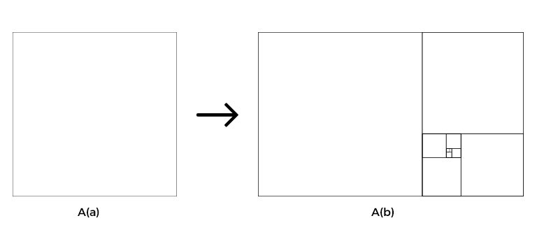
Let’s get it on paper and see how it looks, shall we? Okay, so follow my instructions. Take a piece of paper, now let’s draw a square with, say, a length of 1 unit. Now multiply the length of the square by 1.618 and use the result as a length of a rectangle with the same height as the square.
The resulting rectangle is a very harmonic one, right? Okay, now place the square on the rectangle. Now on the remaining space, if you place another square within a length of the uncovered part of the rectangle and again draw another square on the remaining uncovered portion of the new rectangle and do it over and over, something like the image drawn below will come out. And voila! There you have the Golden Ratio in a design.
Golden ratio logo design is fundamental. A person who is learning graphic designing should have some basic idea about the golden ratio: logo design. A golden ratio is just a tool that will help you create a design that is near perfection.
Perfection in design is what we aspire for as graphic designers. We want our creations to look the best.
The Golden Spiral
In diagram A(b), if we draw an arc from the left bottom corner to the right top corner, continue the arch to the corresponding square, and keep going till we have covered all the squares, the resulting diagram will give us the Golden spiral.

The Golden Circle
Forget about the spiral. For now, let’s get into circles. If we were to draw a circle in each square formed in diagram 1(b), we would harmoniously perfect circles. All of them follow the Golden ratio with their corresponding squares.
And each similar circle, likewise the squares, differs from each other by following the Golden ratio, meaning both same circles have a ratio of 1:1.618, isn’t this fun!

Now that you’ve seen how harmonious and beautiful anything can be if it were to be designed with the golden ratio let’s get into how to use the Golden ratio when creating a logo.
These are some ways to use the Golden ratio in logo design:
- Layout
- Content Placement
- Using the Rule of Thirds
- Using the Golden circles
1. Layout
Setting your dimensions is one of the essential parts of the design. What better way to do it than using the golden ratio. It is effortless to set a size accordingly to the Golden mean.
Suppose the length of the design is 960 pixels. Divide 960 by 1.618 you’ll get your height. This layout will be outstandingly eye-pleasing and more beautiful than any other dimension of the Golden mean.
2. Content Placement
When we look at a design, there is a place where our eyes are naturally drawn towards you will be able to work that out using the golden spiral. The point where the spiral coincides is where the sweet spot, if you’d say, lies. Try to put the most crucial feature of the logo on that spot. If you follow this step, it will make the logo stand out.
3. Using the Rule of Thirds
If you don’t want to undertake such hassle with making the Golden squares, then plot the spiral and whatnot. Don’t worry. There is an easier way, the Rule of Thirds. It is an effortless technique, not so accurate, but it will get you damn close to it.

It’s very usual in cameras and mobile phone camera displays. You can see the gridlines on the screen dividing the image into three columns, both vertically and horizontally, separating the horizontal and vertical lines by using the ratio of 1:1.618.
4. Using the Golden Circle
Using the golden circle is also very easy. After you set your dimensions using the Golden ratio, you now have to use the golden circles to draw your logo by making the circles for your base. The very familiar Twitter and Pepsi logos are great examples of the use of the Golden circle in logo design.
If your design is not based on circles, don’t worry. You can use the Golden squares as a base for your design, or better yet, you can use both the Golden Circle and the Golden Squares, as a base, at the same time for your design.
Final Words: Golden Ration of Logo Design
Now that you know how to use the Golden ratio in your logo design, your creativity and the touch to perfection are delivered by the Golden ratio and all-inclusive.
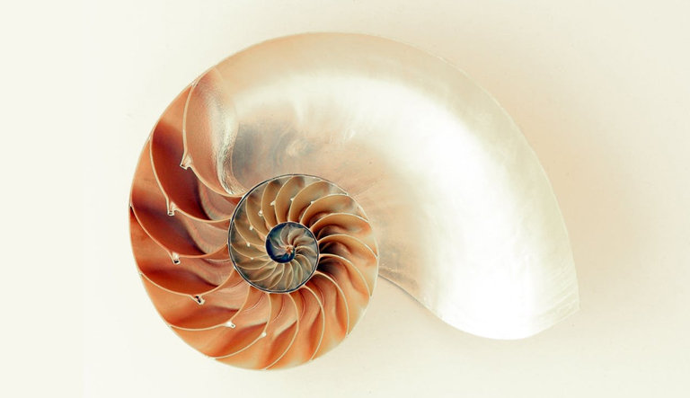
With the layout by the ratio, the content placement by the Golden spiral or the Rule of Thirds, and the perfect base by the Golden Circle and the
Thank you for reading this article about how to use the Golden ratio for a logo design. Hope that you understood the basics of the Golden ratio, outlining by the Golden ratio, content placement by the Golden spiral or the Rule of Thirds, and using the Golden square and circle for the base of your design.

