Whether the customer will buy a product or not strongly depends on the label design. Graphic designers follow a few rules while designing one to make it look visually appealing in the best way possible.
Label design also helps the product attain a permanent position on a store shelf. No matter how excellent your product quality is, if you fail to present it in the right way, you’ll eventually end up with zero sales.
By following certain label design principles, you can, in the end, increase the profits.
Now let’s check out 5 label design principles that will help you beat the competition.
1. Keep It To The Point
If you fail to display the product’s accurate information and quality, the product won’t be placed on the shelf.
To avoid this scenario, you can research what information is included on similar products and put it on your design. Don’t make it difficult for consumers to find the essential product details.
2. Different From Competitors
Suppose you want to stand out from the crowd. In that case, you have to create a unique-looking label, and you can achieve that by choosing a different material for your label, design style, or printing process.
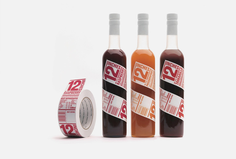
Remember, quality packaging attracts customers from a distance. Hence, you need to use your creativity and the correct visual elements to lure the buyers to the product.
Sometimes taking inspiration from more prominent brands is a way to go. Unless you totally copy/paste the design, you might find yourself copyright infringement.
3. Fail To Meet The Expectations
Misleading the customers by portraying the product in a better light than it really is will most certainly, in the long run, drive the customers away. It may increase sales initially, but it will only be a one-time purchase.
Sometimes taking inspiration from more prominent brands is a way to go. Unless you totally copy/paste the design, you might find yourself copyright infringement.
So don’t put really nice renders and photos on a product box if the product itself looks completely different once you unbox it.
4. Adjustability
Some brands do not produce only one item. If your job is to design the packaging for multiple items, be careful how you create graphics for a specific product because they might come in different shapes and sizes.

So, adjust the label in a way that fits best on all of them. Besides that, the whole collection must look the same; it must be easily recognized by the customer and instantly associated with the brand.
5. Label Redesign
While redesigning the existing label, don’t go overboard with your creativity, so you don’t end up something TOTALLY unrelated to the original design.
Most designers like to start from scratch, but it’s better to repeat the specific elements and shapes of the initial design.
That step alone will make customers recall the brand after the redesign. However, following this path is not easy; it requires immense skills and time to reach a final design with the desired quality.
Now that we got that covered, let’s check the most popular label design styles.
7 Most Popular Label Design Styles
1. Vintage Style
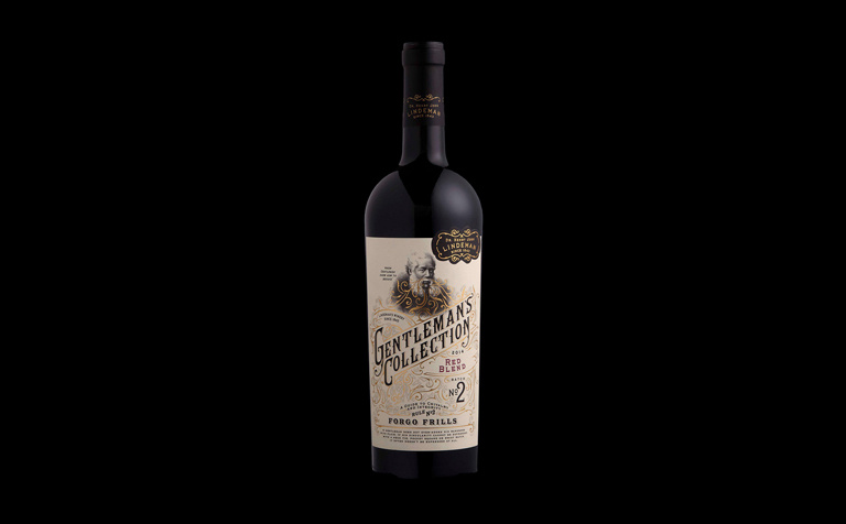
Even though the times before the internet took over our lives are long gone, we can still recreate the old-looking design using modern technology.
With the proper use of decorative elements, we can make a label look as it came from another era.
2. Eco-friendly Design
We are slowly running out of natural resources, and oceans are filling with plastic every day. So it’s your responsibility as a graphic designer to create label and packaging design in an eco-friendly way.
Always try to use biodegradable materials and not wrap plastic in another plastic just because the product will look more luxurious. There are other more ecological ways of achieving that.
Check out The Humble Co. Packaging Redesign by Fulya Kuzu, which might serve you as an inspiration for your next project.

3. Die Cuts
Nowadays, die cuts are trendy and used in an innovative way to reveal the product to the customers, so they can carefully inspect its quality. Try using die cuts designs to show how great the product is.
My favorite example of die-cut packaging is Good Hairday Pasta by Nikita Konkin.

4. Unique Font Style
Choosing the proper typography is essential in graphic design. The right fonts can add an extra appeal to the label.
It can help you create a retro vibe, a bold statement, or a lavish look, so a unique font is sure to stick in people’s minds.

You can use typography to make your product more visible. If you want to distinguish yourself from the competition, hand-lettered or custom-made typography can do the job.
5. Black and White
Black and white packaging is a timeless trend and is one of the best styles for luxurious label design.
You can upgrade this style with the use of different color opacities or add a little splash of color to grab the crowd’s attention.
The black and white contrast creates a feeling of seriousness and dominance.

6. Wild Color Selection
If using the black and white color combination is not your jam, try creating packaging with wild colors. The unique color selection attracts the customers and makes your brand/product look more joyful, young, and fresh.
So this kind of style works best on hip products, and you can also add irregular patterns and shapes to add extra flair.
My favorite wild color selection style is NICHE Tea, done by IWANT design.

7. Minimalism
Minimalism is one of the most popular trends in packaging design. Being the most popular, it is also one of the most challenging designs styles to master because if you go too minimal, the outcome might look sterile. On the other hand, if you start adding too many elements to fill the space, it loses minimalist essence.

I thought about which product shows the mentioned styles in the best way possible, and I concluded that beer labels are the best representations (or maybe I just like beer). So let’s check out the best beer label design.
Best Beer Label Designs
1. Goldhawk Ale
With an already unique name, Goldhawk Ale needed a label design that genuinely reveals the characteristics of their product. They went with a design with no additional text to avoid any unnecessary distraction.
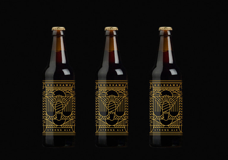
A transparent yellow label design suites the Ale beer type and makes it stand out from the competition.
2. Sakiskiu Alus
Designer Sigitas Guzauskas has done a marvelous job designing the label for their beer bottle. He has used a rubber stamp and handmade paper, which reflects the idea of unique craft beer and gives the overall design a taste of true originality.

3. Russell Brew Co. Angry Scotch Ale
This brand went out of the box while designing the label for their beer bottle. Instead of using a paper label, they printed their graphics directly on the bottle itself. This technique helped them to differentiate themselves from the other beer brands.

In some cases, print-on labels are cheaper than paper ones, and they are more environmentally friendly.
4. Cervecería Sagrada
This beer is one of the most famous Mexican brands, and it is known for its label design – full of colors. The idea for its label design was taken from the Lucha Libre wrestlers who used to wear colorful masks.
They are so famous that the buyer immediately knows where the beer is coming from – Mexico.

This label is an excellent example of how you can use known local elements and combine them with the matchless design, which reflects the specific feature of the product.
5. 1295 Brewing Co.
Sometimes, being simple in design differentiates you from others. The example of Ben Hough’s home-brewed beer is perfect.

The minimalistic color contrast of black and white helps the company gain a competitive edge against the other beer companies.
Final Words: Lable Design Principles
Label design is an essential part of the product if you want to sell it because it’s the first thing a customer catches sight of. Your label should speak for itself about the values and features behind the product.
Never try to mislead the customer by exaggerating the product quality.
Whenever you start with a new label design, draw inspiration from other brands, and improve their weak points.
You might go with minimalism or a wild color combination, but remember that style must always resonate with the brand beliefs.


