Perfectly printing your work is almost as important as the design itself. You need to keep in mind that, sometimes, your creation may look different on paper.
To minimize the difference between what you design on the computer and what you get on paper, I made this list of 5 printing tips for graphic designers.
By following these tips, you and your clients will notice the difference. First of all, you need to be sure you have the perfect printer for you. I made a list of the top 3 printers for graphic designers that you must check out.
In the graphic design world, there is something called Finished Art. In the beginning, “finished art” meant just having everything ready to print a photo in a specific material. Nowadays, the concept hasn’t changed that much; it’s basically having the design ready to be sent to the printing house.

These days, almost every printing house has a place called Finishing Artist. This is the one in charge of checking out if all the documents are ready to be printed. They have to be more detailed than the designers, and they have to do some things to ensure that the work is prepared to print without editing it too much.
Before discussing the printing tips, you need to know the universal printing format. The format accepted worldwide is Adobe PDF, which means Portable Document Format. Basically, a PDF document always will look the same way in any gadget you use.
The printing tips for graphic designers we will talk about are basically finished art strategies. If you follow this advice, you will save a lot of money and time when you’re printing your work at home.
Without anything left to say, these are the 5 tips:
1. Convert The Document From RGB To CMYK
RGB and CMYK are codes of colors, and they are used worldwide when you work on a computer.
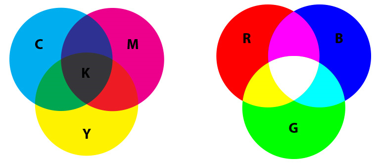
RGB means Red, Green, and Blue. These are the colors used for this code to create all its tones. While CMYK indicates Cyan, Magenta, Yellow, and Key.
The color “key” refers to black, created by mixing all other colors. The final color when you combine all the tones of RGB is white.

The colors on the screen are RGB, while the ones we see on the paper are CMYK. This is because the printer has a restricted color spectrum; meanwhile, you can create almost any color on the computer.
The best option will always be to work from the beginning in CMYK to prevent any modification in the design.
To reduce the difference between the colors you see on the screen and the ones you see on the paper is better to convert your document to CMYK before printing.
When you do this, you must be very careful because some colors in RGB aren’t available in CMYK, so this can modify your work.
2. Outline The Fonts
This is one of the most valuable tips on the list besides the color codes. How many times have you received a document and you can’t read it or the typography is different than the one in the original work? This happens more than you think.

When creating a document, you need to know that not every computer has the same fonts installed. Without the outlined font, it might happen that the letters don’t appear at all, and you will only see a black spot.
To avoid all the problems, you must outline the fonts you use. This simple step will make them look the same on every final medium.
3. Images Proportion And Resolution
The size of a digital image can’t be measured in centimeters or inches, and it has to be done by the number of pixels it has.
How many pixel columns it has of height and how many rows it has of width. The result of the multiplication of those numbers will be the final size.
The resolution is tightly related to the size, and it’s used to value the quality of the image. Basically, it’s how many pixels per inch; it is measured in dpi, which means dots per inch.
They are related so that if you modify one of them, the other two will be affected. There is a rule when it comes to resolution.

All the images you’re going to print must have a resolution of 300 dpi, and the ones that are destined to be an internet file must have a resolution of 72 dpi.
Designers need to play with the image to adapt it to the size they need without modifying the resolution. Like all the rules in the world, it has its exceptions.
If you’re going to print something massive lower resolution will be enough.
Those big movie posters that we see on the highways have a resolution of 60 dpi because they are designed to be seen at a considerable distance.
Remember, a higher resolution means that the image will occupy more space on your gadget.
4. The Size Of The Paper Is Pretty Important
This item is related to the previous one. The size of the image will always depend on the size of the paper. The most commonly used paper size is 8.5” x 11” (210 x 297 mm).
Sometimes you will need to use a smaller or bigger one. It is better to do the design in the correct size from the beginning in these cases. It is always recommended to work on a 100% scale.

If you don’t change the size of the paper on your printer or computer, your work won’t result in the way you want. It will lead you to lose both time and money because it will have less resolution than you want and will be fuzzy, and of course, you will need to print it again.
Sometimes, you might need to change the orientation of the paper to improve the printing.
5. Check Out The Final Document
It is essential to check out the final work before and after printing it. You must avoid misspellings. Also, you need to make sure that all the images have the perfect size and resolution.
It’s always a good idea to call someone that doesn’t know about the work to check it out. A new pair of eyes may notice some mistakes that you might be missing out on.

Before printing your final work, you need to print one on a smaller scale to verify how it looks, if the bleed is ok, and if it’s readable.
Your document has to have a bleed of at least 3 mm from the edge of the paper. This will prevent some images from getting modified if they need to fit each other. It also plays an important role when you cut a flyer.
Final Words: Printing Tips For Graphic Designers
Another good piece of advice is to do timing to your printer. It’s a great way to know if you can accomplish the work by the due date if you are short of time.
By following these simple printing tips for graphic designers, you will save a lot of money and time. Remember, time is money!
These tips will help you improve your reputation as a designer. A good idea is to make a list with these tips and others you consider essential before you start, and make sure you follow every one of them.


